
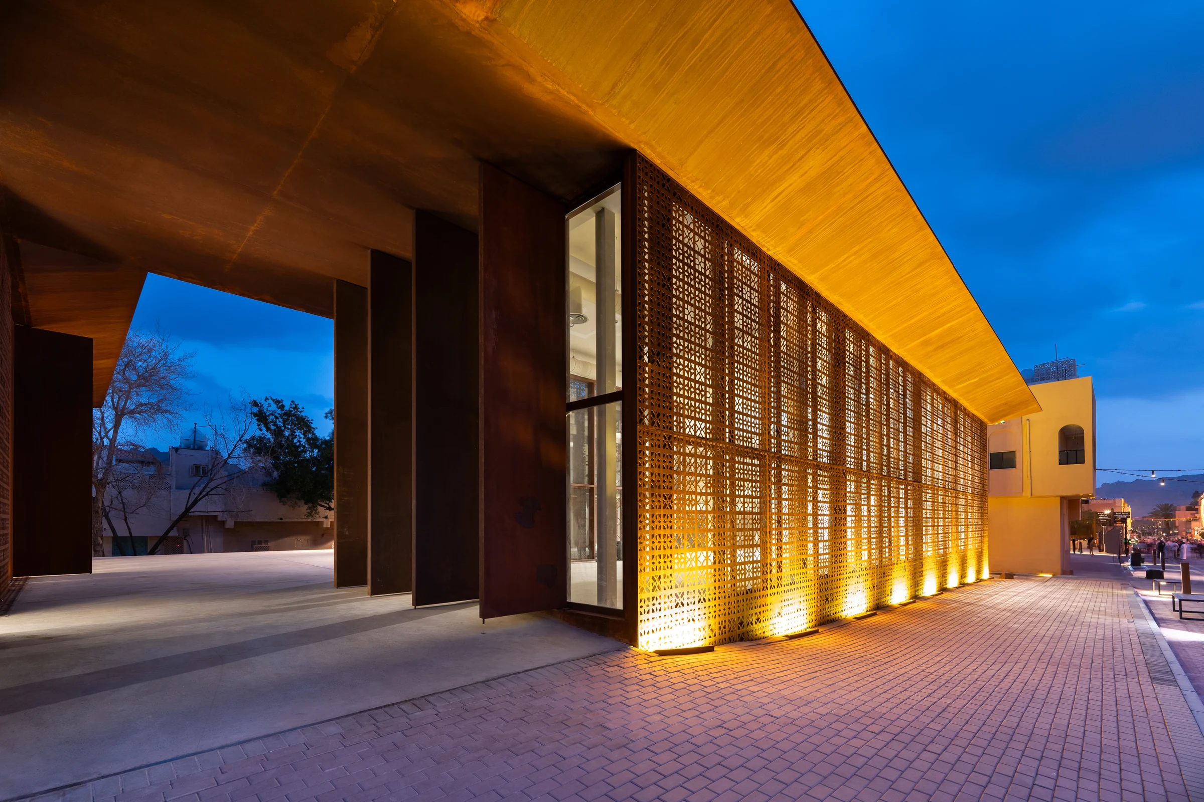
10 Editing Tips to Greatly Improve Your Architecture Photos
Editing is not the part that rescues a bad shoot. It is the part that finishes a good one, and on architectural photography it carries more weight than most people expect, because a building rarely gives you the whole thing in one exposure. The light that flatters the facade blows out the sky. The interior that reads warm turns the view through the glass to a white rectangle. Almost every finished architectural photograph is a decision about what to keep.
I am an architect who became a photographer, and that is the bias behind all of this. My goal in an edit is never to make an image look worked on. It is to make it look like the building on the day the architect imagined it. The ten tips below are the ones that changed my work the most.
1. Fix the verticals before you fix anything else
Everything else you do depends on this. A building photographed with the camera tilted up has converging verticals, and until you correct them your eye keeps reading the frame as a snapshot no matter how good the light is.
Correct it in the raw file, before any local adjustment, because the correction crops and stretches the frame and anything you painted in beforehand will move with it. Shoot wider than you need for exactly this reason. On a tight street where you cannot step back, the correction can eat a surprising amount of the edge.
One caution. Perfectly parallel is not always right. A very tall tower shot from its base can look like it is falling backwards when the verticals are made mathematically straight, and a small amount of convergence left in reads more naturally than none at all.
2. Bracket for the range, then blend for the story
Architecture almost never fits in one exposure, and the honest fix is to capture more than one and combine them rather than to drag a single file until it falls apart.
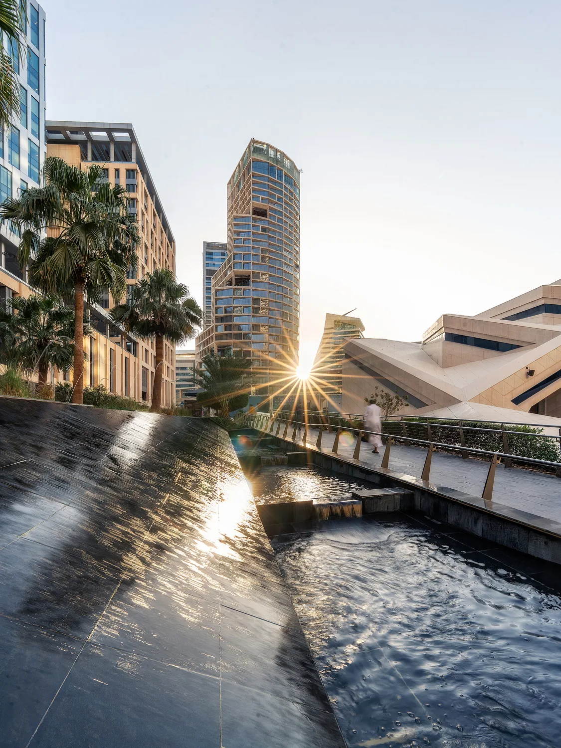
The clearest example in my own work is the hero aerial of King Abdullah Financial District in Riyadh. It is not one photograph. The base frame was shot at a shutter fast enough to hold the buildings sharp at blue hour, which is already a compromise, because a faster shutter would have been sharper and a slower one would have caught more light. Separately, at a much smaller aperture and a shutter over a second, I shot the moving traffic on its own so the cars became light trails. The final image is those exposures blended.
That is not a trick. It is the only way to have a sharp city and moving traffic in the same frame, because they need opposite shutter speeds. Decide on the blend at the shoot, not in the edit, or you will not have the frames.
3. Take colour away before you add any
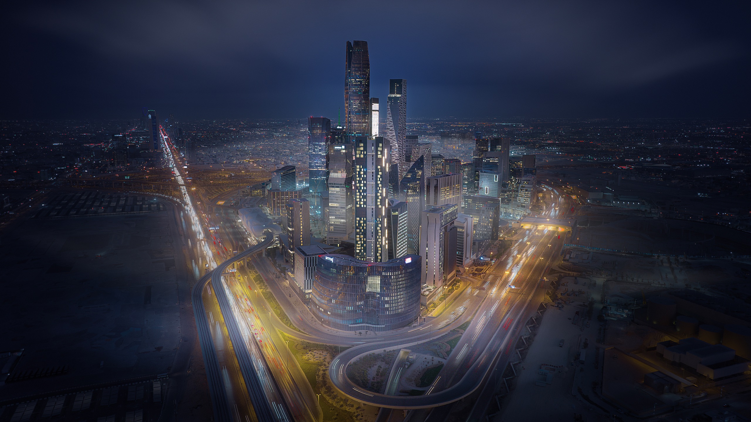
The instinct is to push saturation until the image looks rich. On architecture that is what makes a photograph look processed, because the first thing to oversaturate is the sky, and a screaming blue sky behind a stone building fools nobody.
Work the other way. Pull down the channel that is already dominating, usually the blue in the sky or the green in the landscaping, before you touch anything global. That lifts the ceiling and lets the building's own colours come forward. Stone, concrete and metal are subtle, and they only show up once the loudest colour in the frame stops shouting.
The principle I hold to is that the colour should belong to the scene rather than having been added to it. If a viewer can name the colour you pushed, you pushed it too far.
4. Dodge and burn to give the building dimension
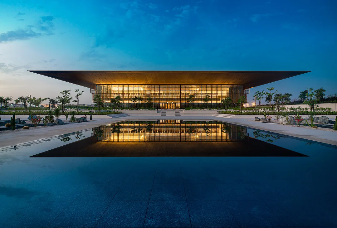
This is the single technique that separates a flat architectural photograph from one that has depth, and it is old darkroom thinking. You are selectively brightening and darkening small areas to shape how the eye travels.
On buildings it does something specific. A facade with repeated bays, fins or balconies is a rhythm, and that rhythm only reads if the light on it varies. Straight out of camera it often does not. Gently darkening the recesses and lifting the leading edges gives you back the relief the architect designed.
Do it on a separate layer so it stays adjustable, and go far softer than feels right. If you can see where you worked, it is too strong.
5. Sharpen the structure, not the sky
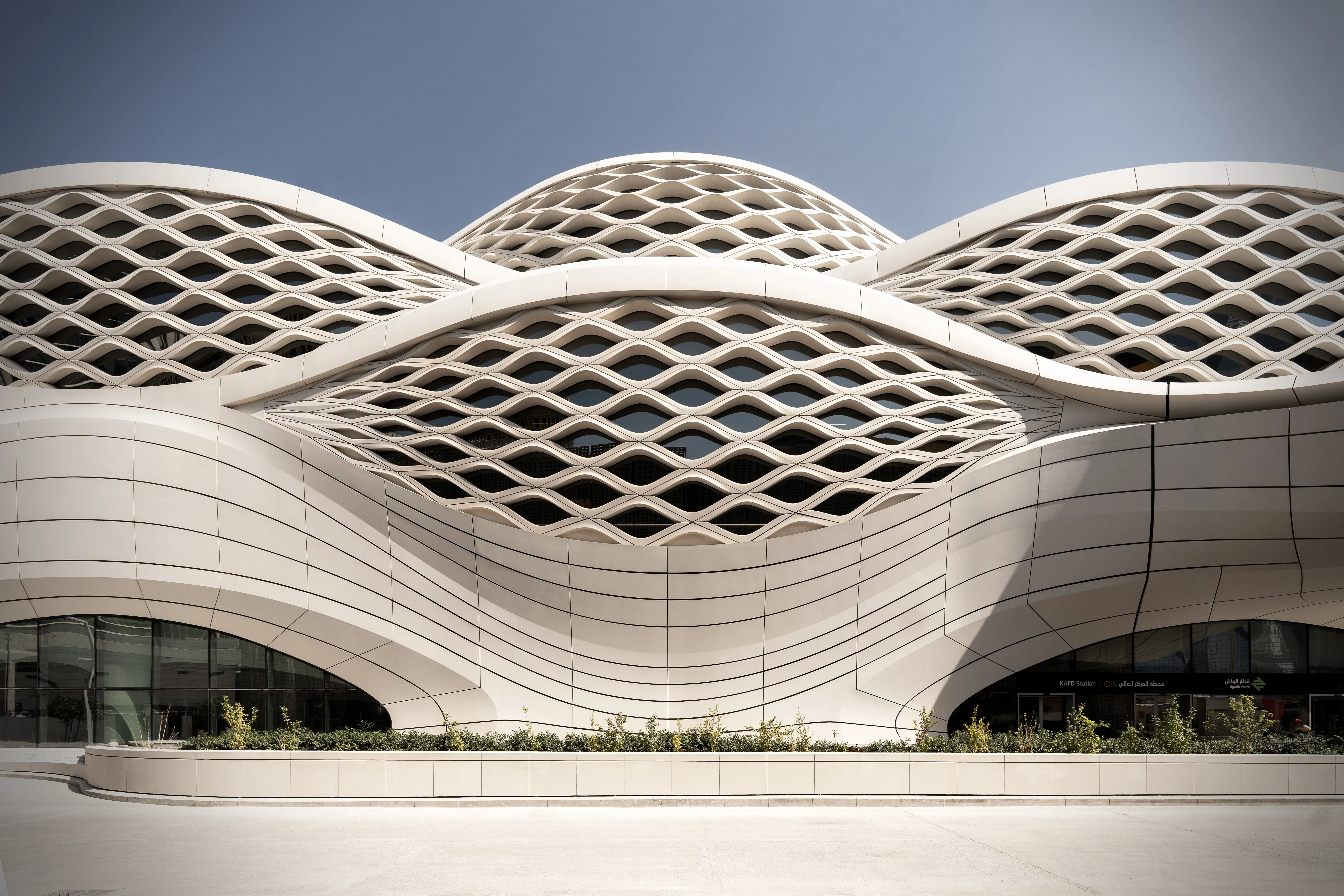
Global sharpening is a blunt instrument on architecture. It finds every bit of noise in a clean sky and every scrap of chroma noise in a shadow, and it makes both worse while doing very little for the thing you care about.
Sharpen selectively, on the building, and leave the sky and the smooth surfaces alone. There is a well known method that applies sharpening on its own layer so it can be masked and dialled back, and any version of that is better than a global slider.
The other half of this is noise. On blue hour and interior work I still prefer manual noise reduction over the automatic options, because the automatic ones tend to smooth the fine texture of stone and concrete into plastic, which is precisely the texture the photograph is about.
6. Remove what the architect did not design
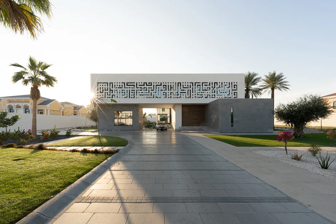
Traffic cones, wheelie bins, a fire hose reel, a temporary sign, a parked van in the wrong place. None of it is part of the building and all of it drags the eye.
Clone it out. This is not dishonesty, it is the same editorial judgement a magazine makes when it schedules a shoot for a Sunday morning. The line I hold is that you may remove what is temporary and you may not remove what is permanent. A bin goes. An air conditioning unit that is bolted to the elevation stays, because that is the building.
Do this early, before the tonal work, so you are not carefully dodging an area you are about to delete.
7. Add glow last, and add less than you want
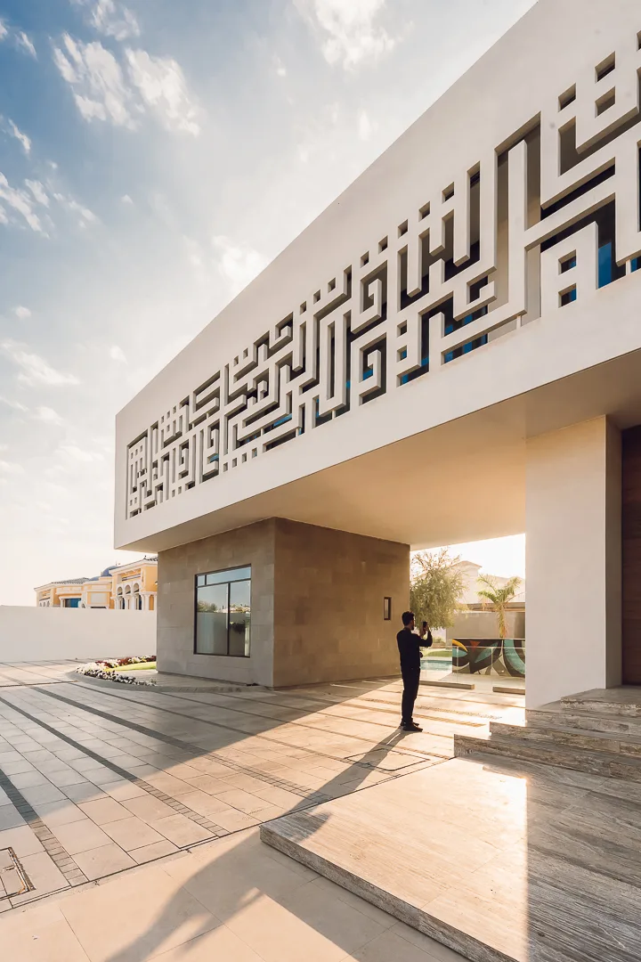
A slight bloom around bright areas is what gives an image that quality of air and light rather than flat digital cleanliness. There is a classic technique for it, well known and widely taught, which blurs a copy of the image and blends it back at low strength.
Two rules. It goes last, or nearly last, because it softens everything under it and you do not want to sharpen on top of it. And it needs masking off every hard edge, or you get a visible halo along every roofline, and a halo is the single most obvious sign of a heavily edited architectural photograph.
Whatever strength looks right, it is probably too much. This is a seasoning.
8. Work non destructively, and name your layers
Everything above should be reversible. Adjustment layers rather than baked in changes, smart objects where you might want to revisit the raw settings, masks rather than erasing.
The part people skip is naming. On a serious architectural edit you can end up with a lot of layers grouped by what they do, one group for separating the building from its surroundings, one for depth, one for the sky, one for colour, one for sharpening. If those groups are called Layer 12 you have built something you cannot come back to. When a client asks in six months for the same building with a different sky, named groups are the difference between an hour and a day.
9. The building lives in the midtones
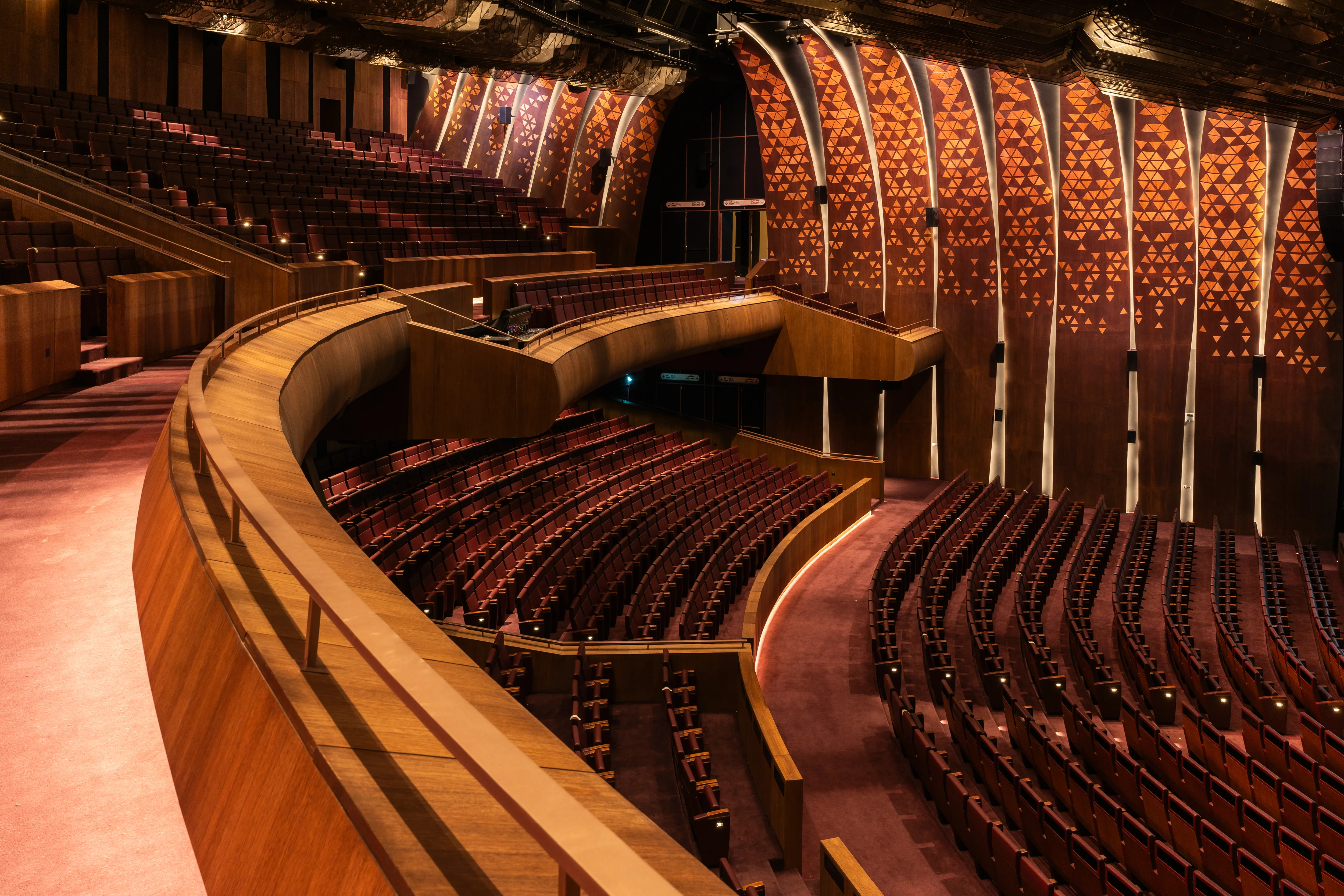
Most of a building is midtone. Stone, concrete, plaster, glass in shade, none of it is highlight or shadow, and that means the midtones are where the contrast that describes form has to happen.
The mistake is to build contrast globally, which crushes the shadows to black and clips the highlights while doing very little to the parts that matter. Build it in the middle instead, and leave the top and bottom of the range alone.
Related, and this is the one habit I would pass on above any other: lift the shadows slightly rather than letting them go to pure black. A shadow with detail still in it reads as air. A shadow crushed to nothing reads as printing. Lifted but never crushed.
10. Keep it natural
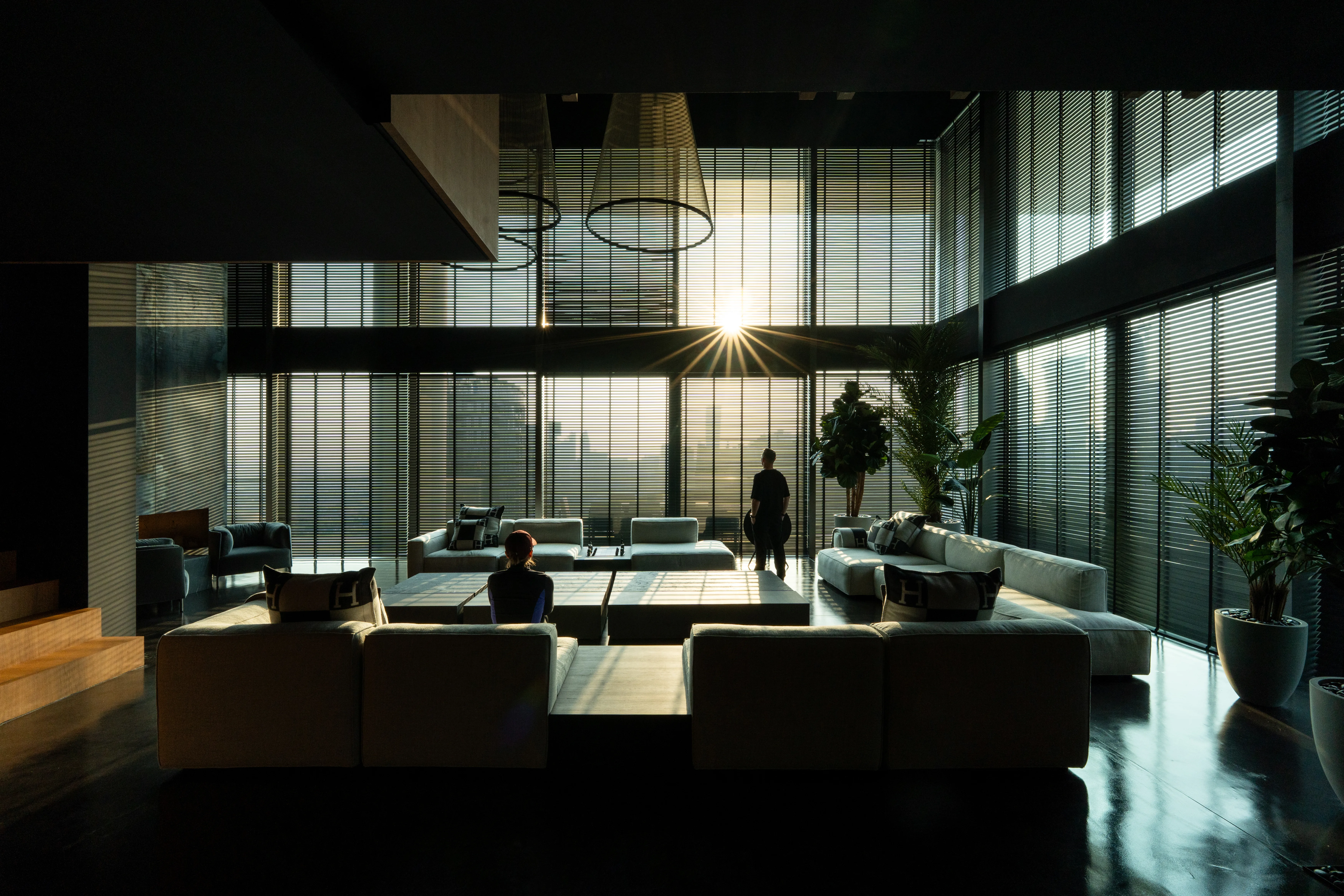
Every tip above can be overdone, and each has a signature when it is. Halos mean too much glow. Grey mush means too much shadow lifting. Plastic stone means too much noise reduction. A purple sky means too much saturation. Visible patches mean heavy handed dodging and burning.
The test I use is simple. Could this light have existed? Not could it be beautiful, but could a person standing there have seen it. An architectural photograph is still a record of a real building at a real hour, and once the viewer stops believing the light, they stop believing the building.
The failure in this genre is almost never an under processed image. It is an image that announces its processing.
Finally
None of this is fast. My own approach came out of years of studying other people's edits, keeping notes on every one, and slowly stripping the result down to the moves that survived contact with real commissions.
Give it time, edit a lot of images, and revisit old ones. The clearest measure of progress in this craft is opening a file from two years ago and immediately seeing what you would do differently.